Week 8
This week I explored how map data could become a meaningful part of a brand identity. The main question was: How can I turn a specific location into a visual system without the data feeling forced?
Category:
Data visualisation
Week:
8
author:
Renske
Location:
Rotterdam
Date:
Data doesn't automatically add meaning
In an earlier experiment, I already noticed that data does not automatically add meaning to a brand. It can create visual variation, but that does not always mean it says something. So this week, I wanted to find a concept where location would not just be an input, but the actual core of the identity.
To do that, I made a mind map with different categories that could possibly work with map data, such as tourism, architecture, cities, and camping. Instead of choosing an existing brand, I worked with fictional categories, because I wanted to first understand what kind of story would naturally fit this kind of data.
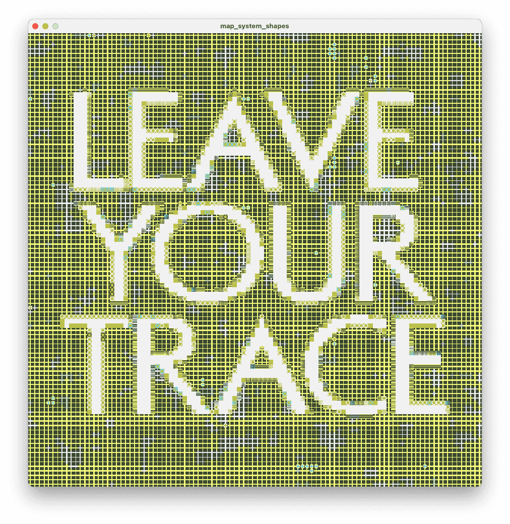
From that process, I ended up choosing the idea of hidden camping spots. That felt like the strongest direction, because location is not just relevant there it is the whole point. Based on that, I started building a fictional brand called Trace, a platform for discovering special camping locations that leave a trace behind as a memory or experience.
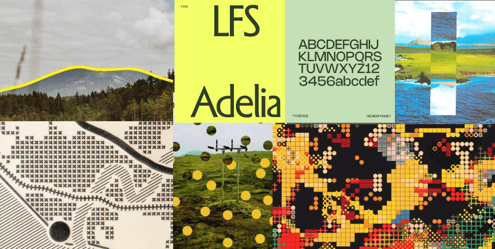
After choosing that concept, I made a moodboard and started sketching possible shapes for the identity. I looked at forms that could feel like abstract map icons or symbols for different kinds of areas. The idea was that these shapes could later be linked to different types of landscapes or place qualities.
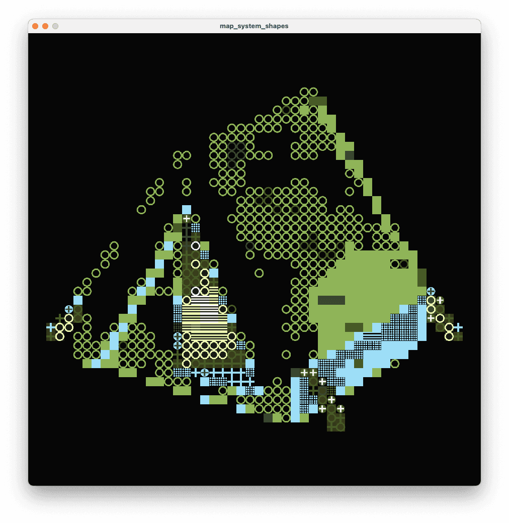
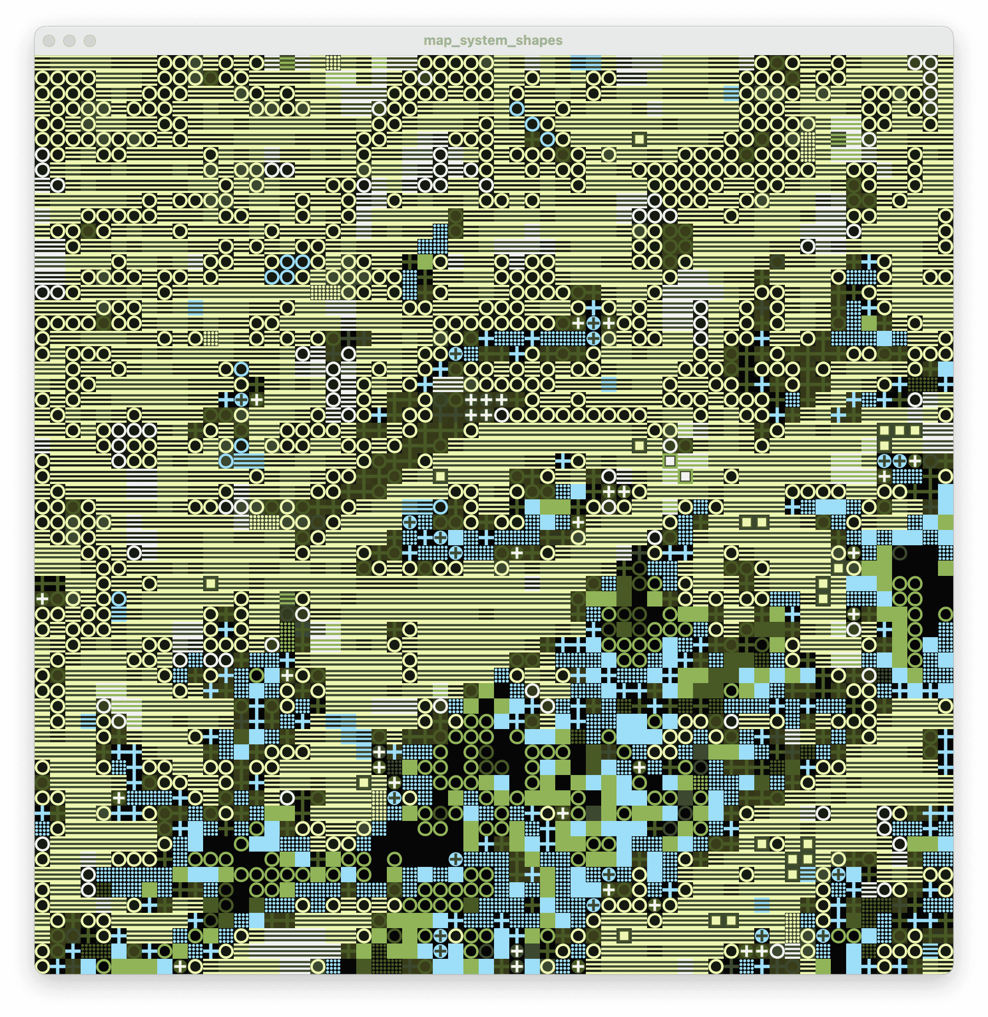
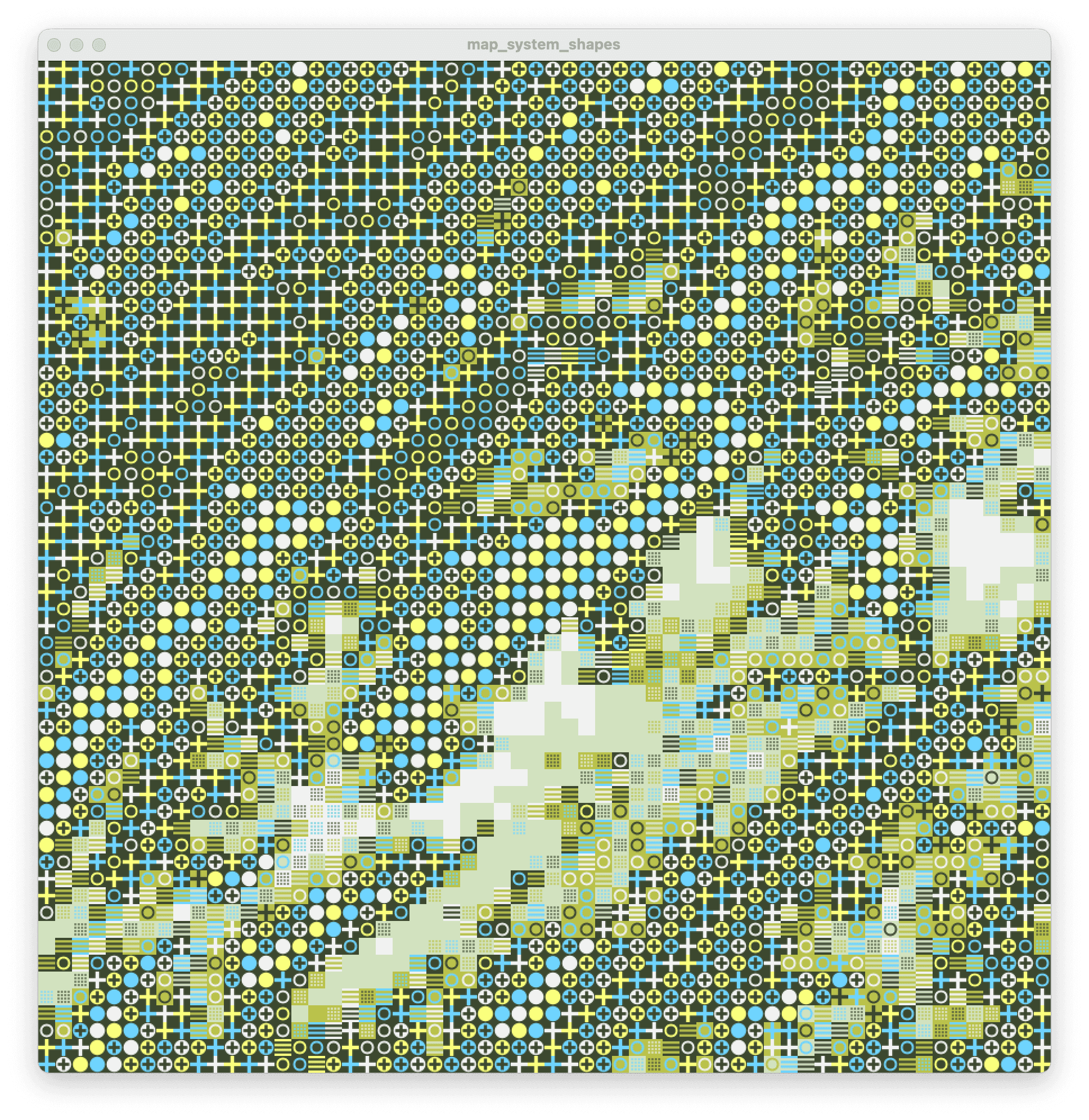
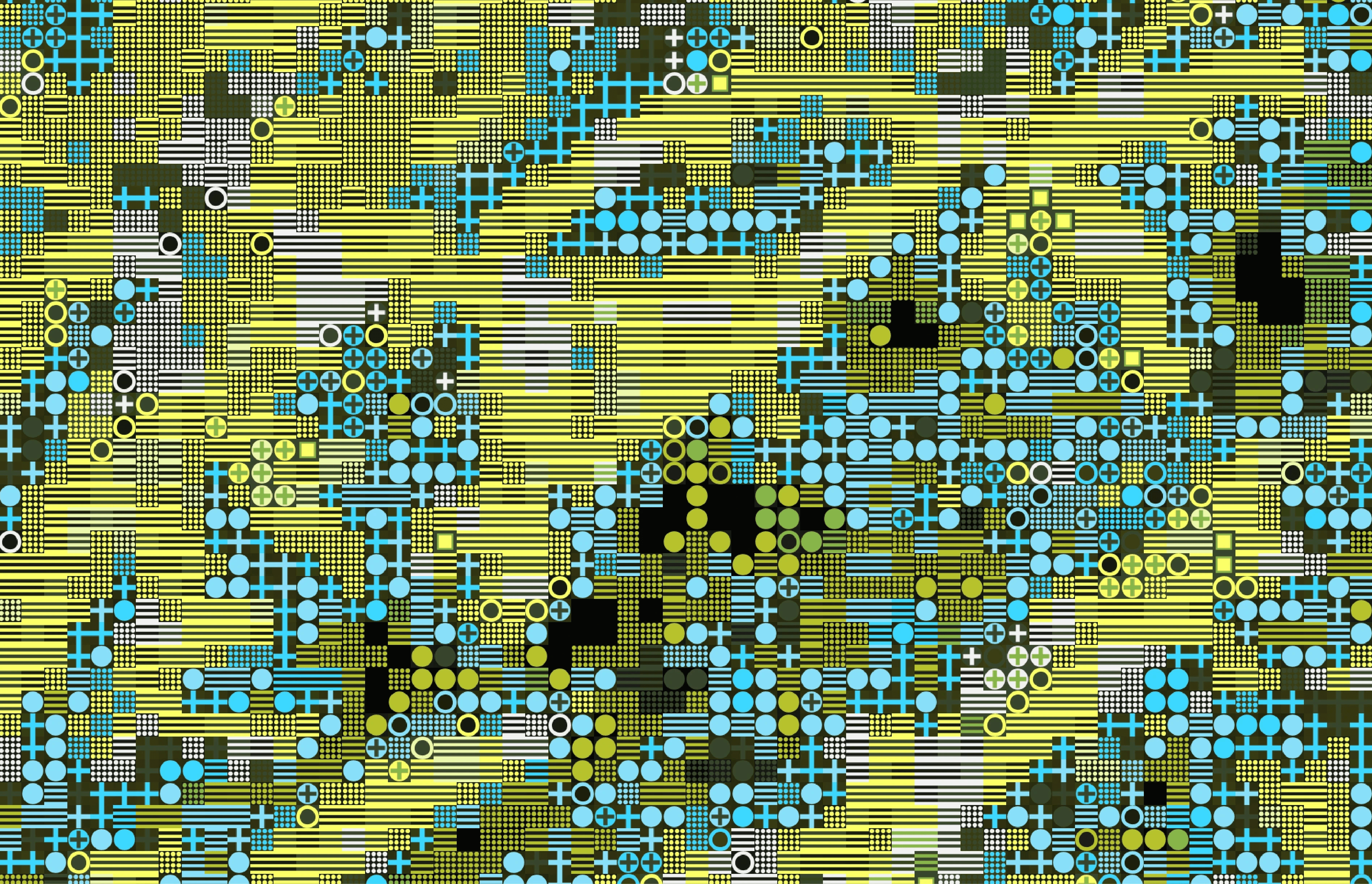
At the end of the week, I designed the first set of shapes in Illustrator and brought them into Processing. Using a brightness-map logic, similar to the ASCII-style image experiments I had done before, I began translating image input into a grid of forms. This became the first step in turning location into a visual identity system.