Week 4
This week was mostly about going deeper into details instead of experimenting. The foundation was there, so it was time to properly understand the functions I'd been using and finally get through the tutorials.
Category:
Processing Tutorial
Week:
4
author:
Renske Mutsaars
Location:
Rotterdam
Date:
Getting deeper
This week wasn't really a week for experimenting the foundation had already been laid, so I had to dive deeper into various functions. I also really wanted to finish the tutorials and make some progress so I could finally say I was done with them and fully move on to experimenting. The problem is that you keep getting distracted by wanting to try things out, which is great for learning but it does slow the process down.
This week I learned how to create masks and work with images placing masks over images and extracting colors from them. This gives some really interesting results because you're pulling specific colors directly from the pixels. What's particularly useful is that you could use these extracted colors later in a brand identity, for example always extracting three colors from a specific object. That makes the tool genuinely practical. I also learned how to calculate the brightness of an image, which lets you apply different colors depending on the brightness level.
I got deeper into arrays, which are mainly used for dividing things into categories for example splitting four colors and distributing them. I also learned how to copy images onto themselves and move the mouseX function to a different location, which creates a kind of magnifying glass effect.


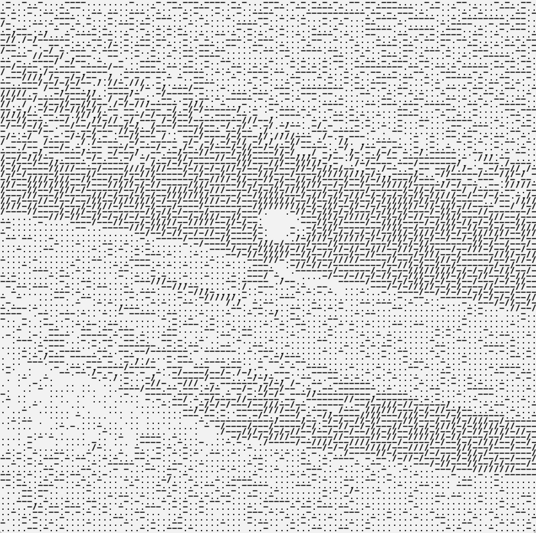
ASCII
Another thing I learned was how to build an ASCII renderer. I was really excited about this at first, but it turned out to be less exciting than expected I think it's just a matter of experimenting more, because I haven't gotten the result I was hoping for yet. I did create some interesting images using different characters. I can see this technique working well for certain identities, especially ones that work with numbers or data it gives a specific atmosphere. It's also interesting how different characters give completely different results. Thicker characters add more depth, using only letters makes things very abstract, and inverting the colors changes everything again. I also learned how to work in 3D in Processing. I had been avoiding this because I didn't think it would be relevant to my project, but it's good to understand how the environment works especially since you can convert 3D objects back into 2D, which gives interesting results. For now I've only laid the groundwork and done a small experiment moving the mouse to increase the detail of 3D objects.
Book findings and results from class
Outside of coding, I picked up some books I had reserved at the library. One is about interviews with designers in the post-digital age, focusing on creative coding. It's quite thick but I thought it might contain things relevant to my graduation or to the tool concept. Another was the Graphic Design Playbook, which I'll be returning. It's a nice book but not something I want to spend time on right now. It's basically a collection of small design exercises, though it did cross my mind that I could try recreating them all in Processing instead. The third book was the Processing Programming Handbook for Visual Artists and Designers. I had it transferred from another location so I didn't know what was in it but I expected more, but it turns out to be a straightforward reference guide and everything in it is also available online and faster to search. The fourth book, Generative Design: Visualize, Program and Create with Processing, surprised me. It started with very complex designs that felt a bit like 2010-era aesthetics, not quite what I'm going for. But as I flipped further through it I found really strong examples. There was a section on type that connected directly to something from last week, the guy who made a tool with drumming and letter forms. This book had more explanation around that idea, and there was also a map of a metro line apparently made in Processing, where adding different components creates different patterns. The TYPE chapter felt really relevant to what I'm looking for. On the last day of the week we had a pressure cooker session in class, one hour to put together and present our graduation project. I found it pretty stressful because I know a lot but don't yet know how to turn it into finished work. I went back to an earlier sketch I had been working on with resizing letters, and combined it with an image and different colors. It actually brought together three things I had learned this week and last week. I kept running into errors because of the time pressure and had to ask ChatGPT for help, but it became clear that my mistakes were small, really just a matter of practice. The result did show that it's genuinely possible for me to build something. I had bound the keys Q, W and E to three different colors and could slide with the mouse. It actually felt like a mini demo of what a tool on the web could look like, with sliders for different sizes and colors. A small but real proof of concept.


